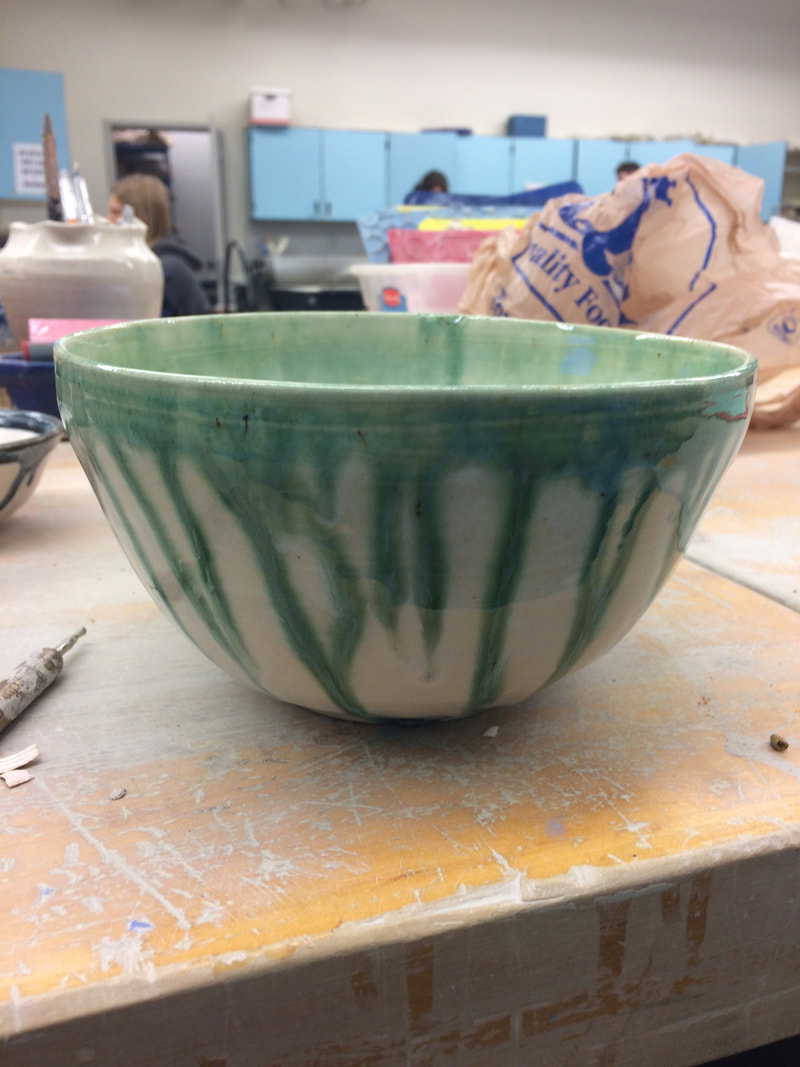
 My next large bowl! This bowl is a taller bowl than I usually make, at about 7-8 inches tall, and equally as wide. I still love it though! I love how the green glaze turned out. I originally thought I was glazing this white, with a dark green drip effect, but I think I used the wrong green...but it turned out alright still because I really like the lighter green. With this project, I really had to work on my trimming and compressing of the lip. I really appreciate the colors and texture of this bowl. The bowl is nice and glossy and smooth, and the colors create contrast against each other and emphasize the lip of the bowl. This bowl really proves to me that I am capable of creating many types of larger projects.
0 Comments
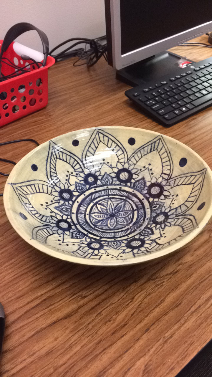 This is the very first large bowl that I have created that has both survived footing, and turned out large enough to be considered a large bowl. It is about 12-14 inches wide and around 5 inches tall. I believe it may have been made out of vashon white. This bowl marks a new chapter in my ceramics life, as I because more intrigued by large projects and intricate glazing designs. For this bowl, I did the most intricate glazing that I have ever done. I created a dark blue mandala on the inside and must have worked on that mandala for almost a week! It took forever! However, it was all worth it in the end. The dark blue stain crated a gorgeous contrast, and the shape of the bowl is so smooth and rounded. I am so proud of this project! The emphasis and pattern are so beautiful, I love it! As with many of my other projects, this was a present for my older sister. She uses it as a fruit bowl in her college apartment.
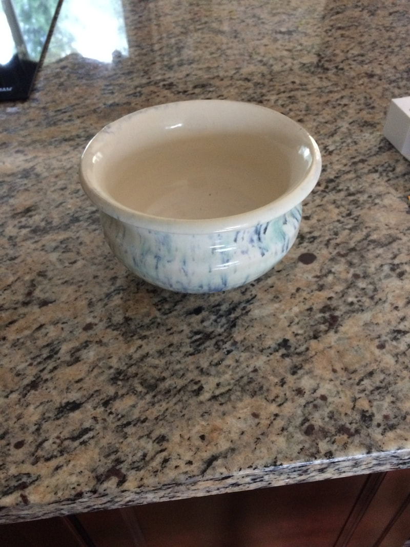 This is my choice project. At about 7-8 inches wide, and 5-6 inches tall, it is easily one of the largest projects I have made. It is made of sea-mix, and has surprisingly even walls. I really love how I glazed this by dipping it in white and then flicking many random colors on top of the white. Even though I used almost all the colors, most of them got eaten up, so the speckles turned out mostly blue, with some hints of turquoises and greens. While it is not the strongest contrast, I think the colors still create a contrast and emphasize the glaze job. The different glaze types are something I have learned a lot about recently, and I think this shows how I have learned to experiment a bit more than I am used to. I really love this pot and am pretty sure there will soon be a plant in it!
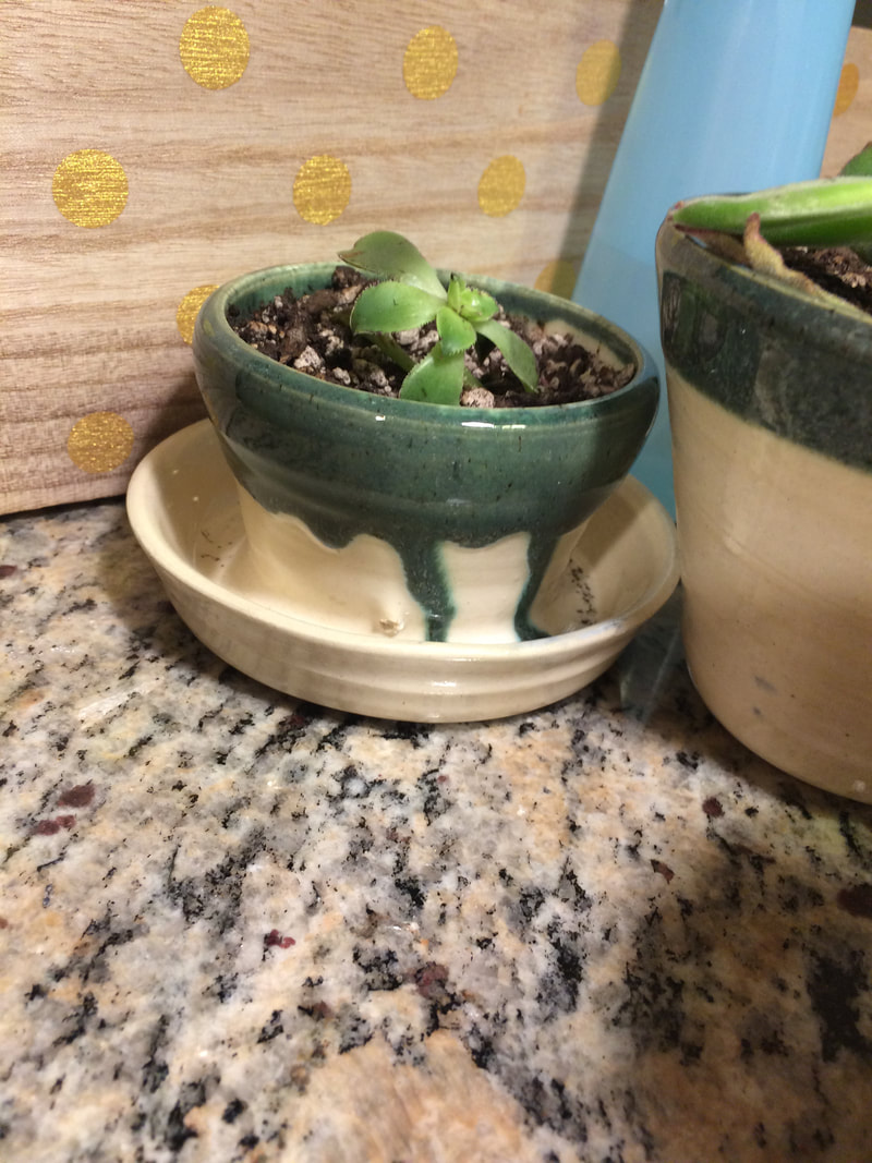 This is my planter. It is a small one, at about 3 inches wide at the top/4 inches wide at the bottom, and 3 inches tall. It is made out of sea-mix clay and has 3 or 4 holes around the bottom for drainage. I glazed it white first, and then added a dark greenish drip effect. The light and dark colors create contrast, and I think the use of the green unites the project as a planter because it symbolizes nature. This assignment really made me focus on making a decent base that I could still string, as well as pulling my walls evenly. I also gave this project to my sister for her plants because she just has too many plants and not enough places to put them.
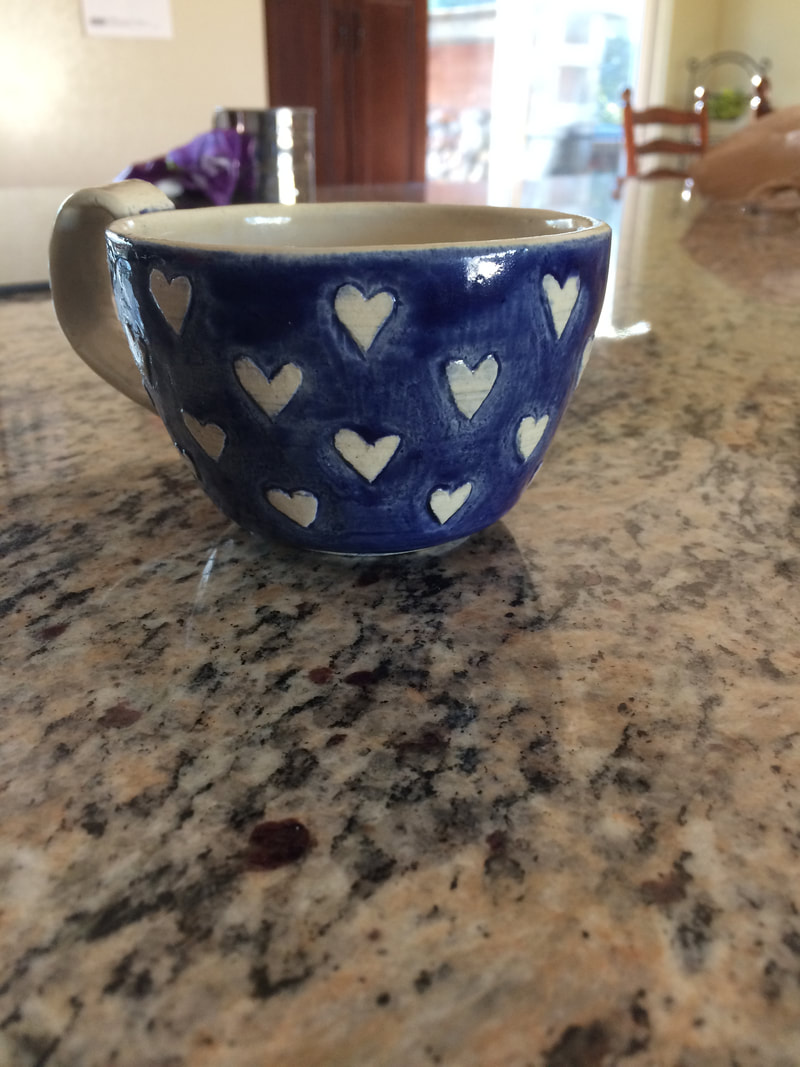 This is the first cup I have made this year. While it is a bit small for a cup, at about 3 inches wide and about 3 inches tall as well, it is still one of my favorite projects so far! I made it out of sea-mix and glazed the inside and the handle white, and dipped the outside of the cup in dark cobalt blue, and then wiped the cobalt off the hearts and glazed them white too. With this project, I really learned the importance of patience... I had to be very patient and meticulous to get all of the hearts good (even though they are definitely not near perfect). I love the contrast that the dark background color and white hearts created and I think it creates a harmonious project, especially since the handle is white as well. I was nervous about how this would come out, and I think it is pretty good overall! I gave it to my mom for her birthday and she really liked it!
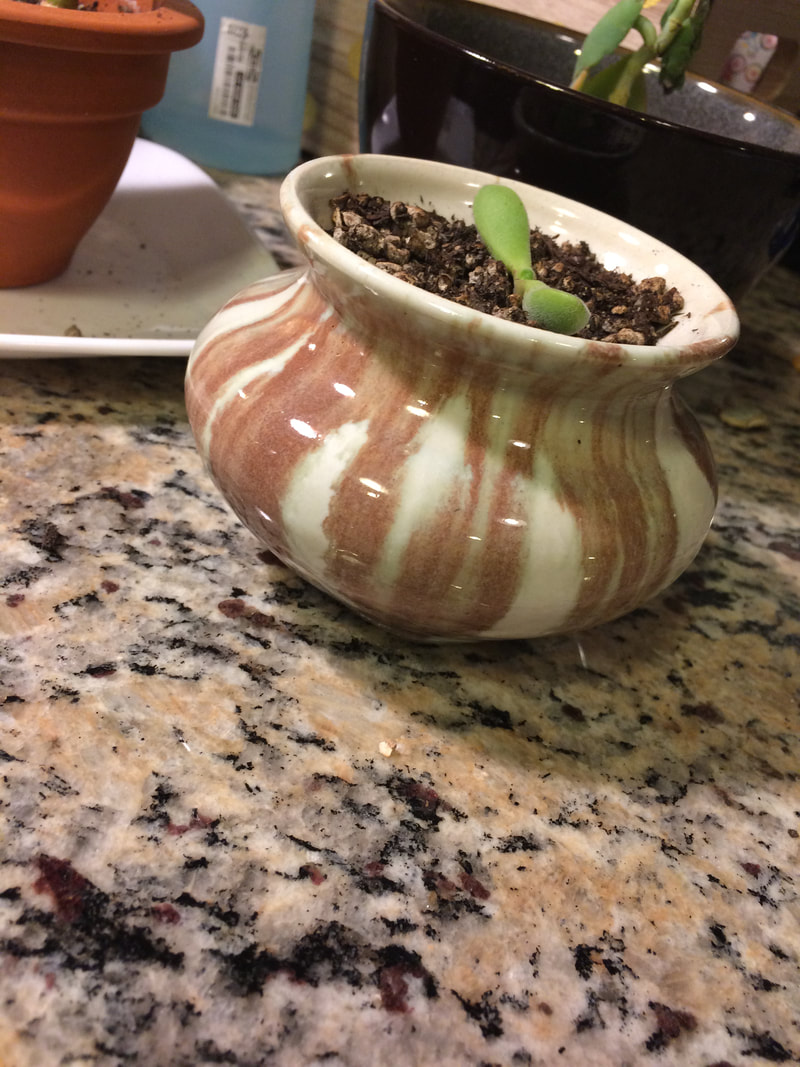 This is my vase project. It is about 3 inches tall, and 4 inches wide. I believe it was made out of sea-mix and it's very cute! I gave it to my sister because she is obsessed with plants. I glazed it white, and then used the burnt orange color on top of it. I love this orangey glaze because of how it runs and turns all brownish orange with hints of green undertones. It's so cool! I really worked on my choking for my vase, which you can see by the narrower neck of the vase. There is a lot value with the light and dark colors of this vase. You can also see the importance of the colors in how they create contrast against each other, movement in the shape, and creates harmony as the green plant brings out the green undertones of the glaze.
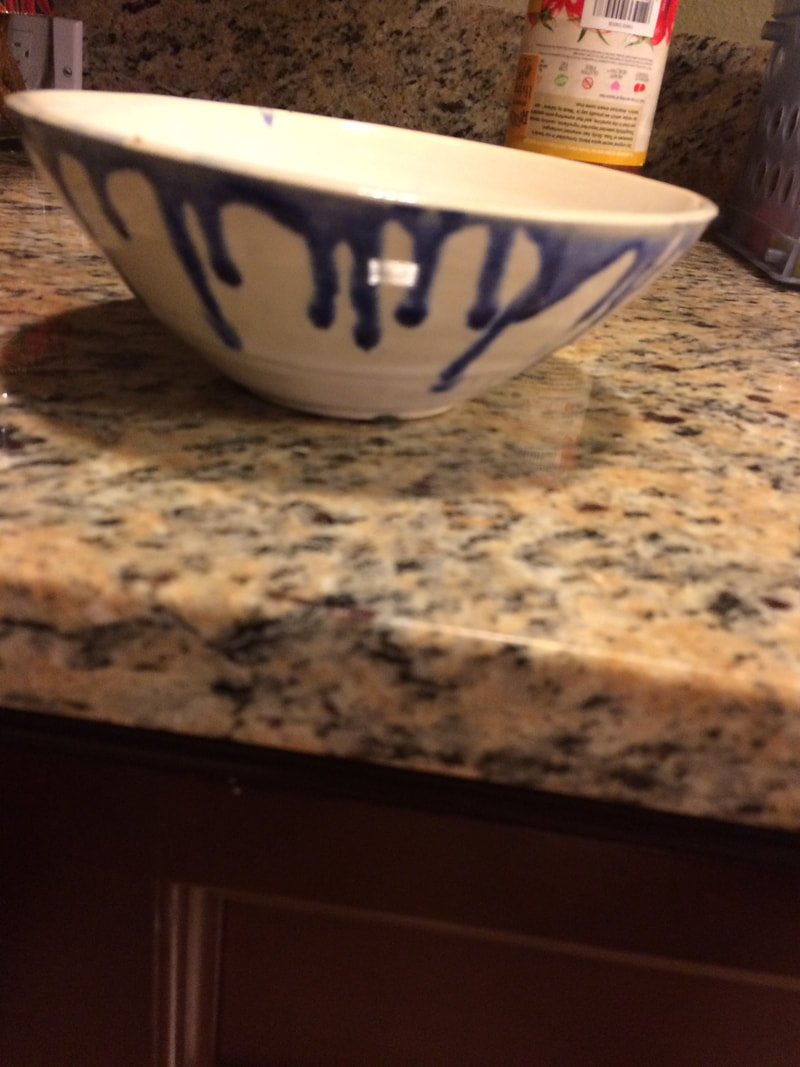 This is my bowl 2. It is a wider bowl, with a width of about 6.5 inches and a height of about 3 inches. This was another sea-mix project, which I love because of how sea-mix fires and that it is great for water coloring on. It is a nice, smooth, wide bowl. I glazed it white and used the beautiful, dark blue/cobalt glaze [that I mixed myself ;)] for a drip effect in order to create contrast against the white base color and emphasize the lip of the bowl. I love the colors and form of this bowl! This blue and white mix it also really pretty and I think I might start glazing more projects like this.
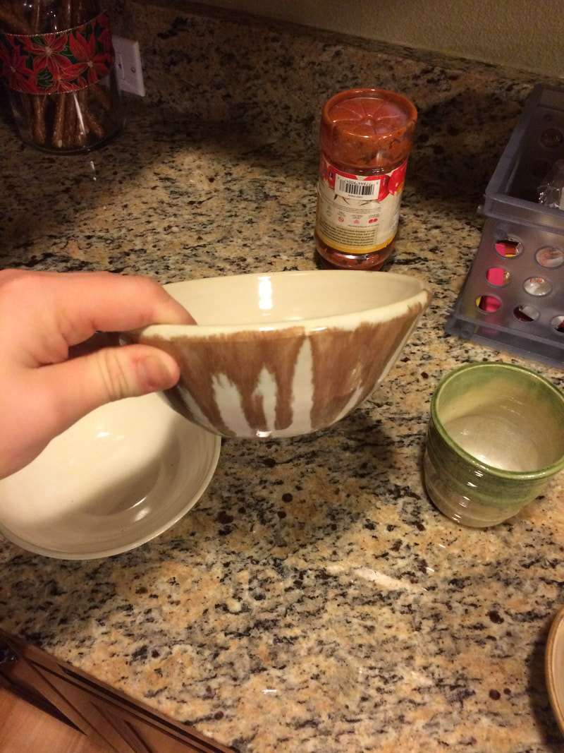 This is my bowl 1. It is about 5-6 inches wide and 3-4 inches tall. I made it out of sea mix, and I really like the colors! I glazed the surface white, and then used the pumpkin ish burnt orange color to get a drip effect. While throwing this bowl, I learned the importance of even walls, because all my previous bowls either collapsed from being too thin, or were just very awkward. I really love the color of this bowl, with the darker orange creating contrast against the off-white base color. The orange color also gives emphasis to the lip of the bowl and represents the fall season. I also love the smooth texture of it!
|
AuthorWrite something about yourself. No need to be fancy, just an overview. Archives
December 2017
Categories |
 RSS Feed
